Storybook Screen Reader Addon
The Speakable Storybook addon predicts screen reader output for every component story in real time. See what NVDA, JAWS, VoiceOver, and Narrator would announce without leaving your component development workflow. Catch accessibility issues while you build, not after you ship.
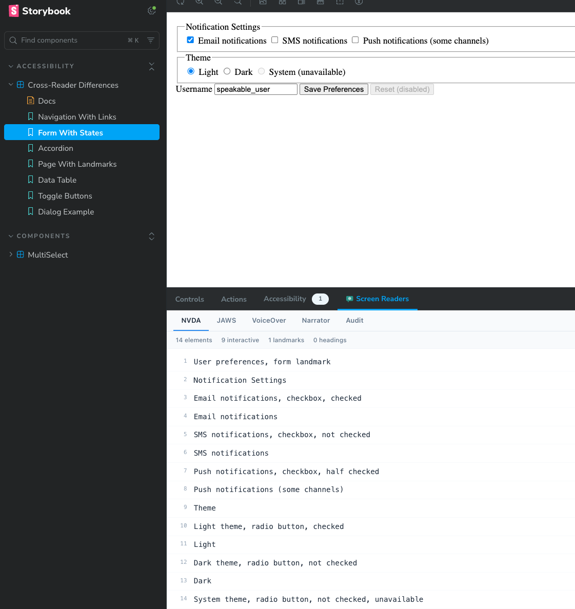
What the Addon Shows You
The addon adds a "Screen Readers" panel to Storybook. When you render any story, it instantly shows predicted speech output for four screen readers, plus an accessibility audit.
Per-Reader Predictions
Separate tabs for NVDA, JAWS, VoiceOver, and Narrator. Each produces genuinely different output reflecting how that reader handles roles, states, and announcement order.
Live Updates on Interaction
Change a control or toggle a state in your story. The predicted output updates immediately to reflect the new ARIA states.
Interaction Timeline and Diff
Declare an interaction sequence and the Timeline tab records focus moves, ARIA state changes, and announcements. The Diff tab flags regressions against a saved baseline.
Accessibility Audit
The Audit tab flags missing accessible names, heading hierarchy violations, and unnamed landmarks with severity levels and suggestions.
Element Statistics
A stats bar shows total elements, interactive elements, landmarks, and headings for quick structural awareness.
How Screen Reader Output Differs Per Reader
The addon uses the same Speakable engine that powers the CLI and MCP server. Each reader produces genuinely differentiated output. Here are some common differences you will see across tabs:
| Element | NVDA | JAWS | VoiceOver | Narrator |
|---|---|---|---|---|
| Link | Home, link | Home, clickable | Home, link | link, Home |
| Heading | Welcome, heading level 1 | Welcome, heading 1 | heading level 1, Welcome | Heading level 1, Welcome |
| Navigation | Main, navigation landmark | Main, navigation region | navigation, Main | navigation, Main |
| Image | Logo, graphic | Logo, graphic | Logo, image | Logo, image |
| Disabled button | Save, button, unavailable | Save, button, unavailable | Save, button, dimmed | Save, button, disabled |
| Checkbox (unchecked) | Accept, checkbox, not checked | Accept, check box, not checked | Accept, checkbox, unchecked | Accept, check box, unchecked |
How to Install the Storybook Addon
The addon ships as part of the @reticular/speakable package. No extra package to install. If you already use Speakable for CLI or MCP, you have the addon ready.
Step 1: Install Speakable
If you have not installed Speakable yet:
npm install --save-dev @reticular/speakable
Step 2: Add to Storybook Config
Add the addon to your .storybook/main.ts (or .storybook/main.js):
import type { StorybookConfig } from '@storybook/your-framework';

const config: StorybookConfig = {
  stories: ['../src/**/*.stories.@(js|ts|tsx)'],
  addons: [
    '@storybook/addon-essentials',
    '@reticular/speakable/storybook', // Add this line
  ],
  framework: '@storybook/react-vite', // or your framework
};

export default config;
Step 3: Start Storybook
Start Storybook as usual. The "Screen Readers" panel appears at the bottom alongside your other addon panels (Actions, Controls, etc.):
npm run storybook
No configuration required beyond adding it to your addons array. The addon automatically analyzes every rendered story.
How the Addon Works Under the Hood
A Storybook decorator wraps every story. After each render, it captures the story's live DOM.
The core Speakable engine builds an accessibility tree from the DOM: roles, names, states, values, and hierarchy.
Four separate renderers produce output for NVDA, JAWS, VoiceOver, and Narrator, each with its own announcement order, role vocabulary, and state phrasing.
A MutationObserver watches for DOM changes (attribute mutations on ARIA states, child additions/removals). When the component updates, predictions refresh automatically.
If the story declares a parameters.speakable sequence, the decorator runs it, attaches the runtime engine, and records an accessibility event timeline. When a baseline exists, it diffs against it and populates the Timeline and Diff tabs.
The audit engine runs concurrently, checking heading hierarchy, landmark structure, and interactive elements for missing accessible names.
Supported Frameworks
The addon works with any Storybook framework that renders to the DOM. The analysis runs on the final rendered HTML, so it is framework-agnostic:
@storybook/react-vite@storybook/react-webpack5@storybook/vue3-vite@storybook/svelte-vite@storybook/html-vite@storybook/web-components-viteRequires Storybook 8.x. The addon uses the Storybook Manager API and panel registration system introduced in Storybook 7, but is tested and optimized for version 8.
Using the Addon with Storybook Controls
Combine the addon with Storybook Controls to explore how prop changes affect screen reader output. For example, toggling a disabled prop will show the reader output update from "button" to "button, unavailable" (NVDA) or "button, dimmed" (VoiceOver) in real time.
Tip: Write stories that isolate specific ARIA patterns. A story for "Button expanded" and another for "Button collapsed" makes cross-reader differences immediately obvious without needing to interact.
Understanding the Audit Tab
The Audit tab runs a lightweight accessibility check on the rendered story. It reports issues that would affect screen reader users:
Missing accessible name on interactive elements (buttons, links, inputs without labels)
Heading hierarchy violations (skipped levels), unnamed landmarks
No landmarks found (consider adding semantic structure)
The audit runs the same checks as the CLI audit command and the MCP audit_html tool.
How to Capture an Interaction Timeline in Storybook
The per-reader tabs analyze the story at a point in time. The Timeline tab goes further: it runs an interaction sequence against the rendered story and records the accessibility events that result, in order. That includes focus transitions, ARIA state changes, live region announcements, and dialog open and close events. This is how you verify dynamic behavior, such as a modal moving focus on open and restoring it on close, directly in Storybook.
Timeline capture is opt-in per story. Add a parameters.speakable block with either a full sequence or a named built-in pattern. The sequence runs automatically once after the story renders, so the Timeline reflects that scripted run rather than manual clicking in the preview.
Option 1: Use a built-in interaction pattern
Built-in patterns cover common ARIA widgets. Override the selectors to match your markup:
export const Dialog = {
  render: () => renderDialog(),
  parameters: {
    speakable: {
      // 'modal-dialog' | 'combobox' | 'tabs' | 'accordion'
      pattern: 'modal-dialog',
      selectors: { trigger: 'button.open', container: '[role="dialog"]' },
    },
  },
};
Option 2: Write a custom sequence
When a built-in pattern does not match your component, declare the actions yourself. Supported actions include tab, shiftTab, click (with a selector), enter, space, escape, the arrow keys, key (with a combo), and wait (with ms).
export const Disclosure = {
  render: () => renderDisclosure(),
  parameters: {
    speakable: {
      sequence: {
        description: 'Tab to the toggle and open it',
        actions: [{ type: 'tab' }, { type: 'enter' }],
      },
    },
  },
};

// Opt a story out of timeline capture (static tabs still work)
export const StaticOnly = {
  render: () => renderThing(),
  parameters: { speakable: { timeline: false } },
};
parameters.speakable reference
| Field | Type | Description |
|---|---|---|
| sequence | { description, actions[] } | An explicit interaction sequence. Highest priority. |
| pattern | 'modal-dialog' | 'combobox' | 'tabs' | 'accordion' | A named built-in interaction pattern. |
| selectors | { trigger?, container?, content?, items?, input? } | Selector overrides for the chosen built-in pattern. |
| timeline | false | Disables timeline capture for the story. |
Set a baseline and catch regressions with the Diff tab
On the Timeline tab, click Set baseline to store the current timeline for that story. Baselines persist in the browser, keyed per component and story. On later renders, the Diff tab compares the current timeline against the baseline and classifies each change by severity (critical, high, medium, low). A broken focus trap or a dropped announcement then surfaces as a regression instead of a silent behavior change.
For headless, whole-library regression runs in CI, use the CLI instead. See Runtime Analysis for the speakable runtime --storybook pipeline with snapshot baselines and CI mode.
Speakable Addon vs @storybook/addon-a11y
Both addons help with accessibility, but they solve different problems and work well together:
| Aspect | Speakable Addon | @storybook/addon-a11y |
|---|---|---|
| Focus | Screen reader output prediction | WCAG rule violations (via axe-core) |
| Output | What users hear, per reader | Pass/fail rule results |
| Best for | Verifying announcement quality and content | Catching WCAG compliance issues |
| Reader differences | Yes (4 readers with distinct output) | No (generic rule-based) |
| Use together? | Yes. Use both for comprehensive coverage. | |
Limitations and Accuracy
The addon provides heuristic predictions, not a screen reader emulator. Keep these limitations in mind:
- Predictions approximate common screen reader behavior. Real output varies by reader version, user settings, and verbosity level.
- The per-reader tabs show the DOM state at a point in time. To capture focus management (focus trapping, focus restore) and live region announcements over time, add a
parameters.speakablesequence and read the Timeline tab. - Timelines run the scripted sequence you declare, executed once after render. They do not record free-form manual interaction in the preview.
- Live region timing and interruption behavior differs across readers. The Timeline records that an announcement occurred, not each reader's exact interruption model.
- CSS-based hiding (
display: none,visibility: hidden) is detected, but complex CSS state transitions may not be captured on initial render.
Always verify with real screen readers before release. The addon is a development-time tool for catching obvious issues and understanding cross-reader differences. It does not replace testing with NVDA, JAWS, VoiceOver, or Narrator on actual devices.
Related Pages
Screen Reader Comparison
Detailed breakdown of how NVDA, JAWS, VoiceOver, and Narrator announce different elements.
Component Patterns
Accessible patterns for common UI components with predicted screen reader output.
MCP Integration
Use Speakable with AI coding assistants via the Model Context Protocol.
Design Systems
Integrating screen reader testing into your design system component library.